Mobile First vs Mobile Friendly. How will mobile-first indexing impact SEO?
Introduction
Website Designs have been constantly evolving with a primary objective to provide the best user experience to the website visitors. Over the past decade there has been a tremendous change in the web interfaces in order to adjust to various devices.
Need of Responsive Design
Looking at how far websites have evolved since the early 2010s, they were desktop sites rendered on tiny mobiles. Reading content or even filling up a form was a practical joke.
It later evolved to a separate ‘M’ version of the website, typically m.example.com. This design solved 2 major issues of browsing on the internet:
- How a website appears on the phone
- Creation of mobile specific content
This approach provided entirely separate experiences to users on Mobiles and Desktop, though they were 2 different sites.
With the increase in mobile traffic, website owners soon realized the need to redesign the browsing experience. From being a simple calling card for businesses, websites have now turned to an Online Store where users can compare and buy products.
According to comScore, the data shows that majority of consumers are multiplatform users. Taking the multi channel switching behavior into consideration, business owners have now realized the need to design a website that adapts to various platforms. A responsive design ensures best user experience irrespective of the device.
Remember the last time you tried the reverse pinch gesture to access a website on your smartphone. Thanks to responsive website designs.
How is Mobile First different from a Mobile Responsive Website
Is mobile-first the new black?
You may often come across these questions from clients, “Is mobile-first technology not same as mobile friendly?” “My website looks great on mobile, do I still move to mobile-first?” Most of them are mistaken; Mobile-first is not a technology. Mobile- First is a design approach for a modern responsive website.
If a responsive site renders great on multiple devices, why is it necessary to opt for a Mobile-First Strategy? According to smartinsights, mobile users now average above the desktop usage by 30%. Today most of the users rely completely on their mobiles for their online activities. Based on the User’s search behavior, Google has identified the need to switch to a Mobile-First indexing in order to make the search results more useful to the users.
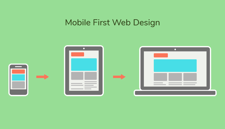
Responsive website were built with a desktop-first approach, where a site was initially designed for a desktop and was later scaled down to various other devices.

On the other hand, a mobile-first approach is to design for a mobile, which is definitely a mobile friendly version, which will be later scaled up for desktop and other devices.
The impact of Mobile-First Index on SEO
We’ve seen how Mobile-First approach has changed how websites will be rendered on mobile and other devices. But how will Mobile-First affect the SEO world? Do business owners have to change their SEO strategy? Will this be another Mobilegeddon?
Well, Google has clearly stated that there will not be any changes in the website rankings if you are following the best SEO practices.
Most of the Google searches now happen on mobiles but Google indexes desktop first. As a result users are provided with results related to desktop content. In order to fix this, along with the Mobile-First design approach, Google will also change its indexing pattern. Google also announced that they have begun their experiments to index mobile versions to rank pages on a site which will affect and change the SEO game drastically.
Currently search engines would first crawl the desktop version of the website, then identify and crawl the mobile version of the website and determine the rankings for the website.
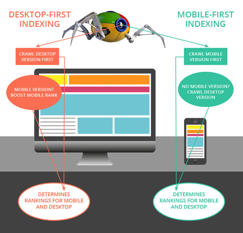
Instead, mobile-first indexing refers to primarily indexing the mobile content in order to rank a website. This means, if your website is not mobile friendly, it will impact the SERP results regardless whether you are a desktop user or a mobile user.
No mobile version yet?
If you do not have a mobile version yet, this does not mean that Google will not index your site.
Google said:
If you only have a desktop site, we’ll continue to index your desktop site just fine, even if we’re using a mobile user agent to view your site.
But you will lose the advantage to rank better against your competitors!
Do we need to change our content strategy?
Yes, as an SEO, we have always suggested users to add more relevant content to the website considering the LSI, Latent Semantic Indexing. Effectively, its time for content strategist to now take a ‘Less is More’ approach.
The challenge would be to optimize the content by reducing the length of the content and providing the exact content. Does this mean that tabbed content or content within an accordion will be considered? Perhaps, yes! as such content makes sense on a mobile rather than on a desktop. As stated by Gary Illyes, expanded content can be settled upon if it enhances the user experience.
How to identify if your site is mobile-first indexed?
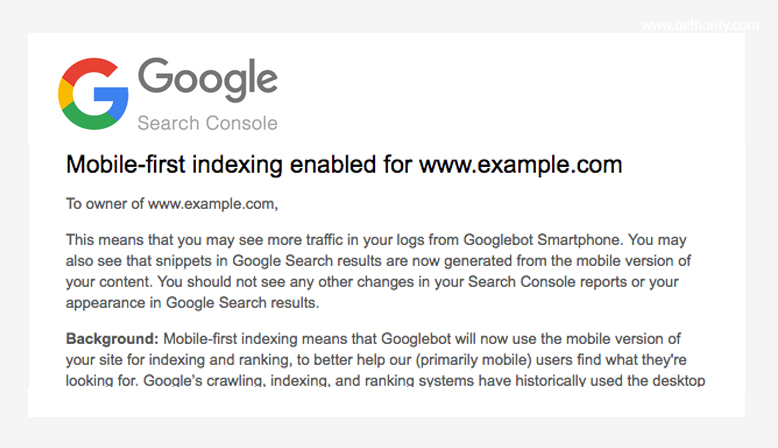
Google is already sending notifications to site if the site is ‘mobile-first indexed’ Google also states that if a site is being migrated to mobile-first indexing, site owners will see a major traffic from Googlebot Smartphone
Are you prepared?
Below are the major actions a site owner has to take into consideration in order to perform better in the SERP:
Recommendations as stated by Google:
- Having mobile-friendly content is still helpful for those looking at ways to perform better in mobile search results.
- Having fast-loading content in order to rank against your competitors. Users may focus on implementing fast loading AMP pages for an added advantage.
- As always, ranking uses many factors. We may show content to users that’s not mobile-friendly or that is slow loading if our many other signals determine it is the most relevant content to show.
- If you have a rel=canonical tag, leave it
Conclusion
As stated above, websites may not see a major change after the mobile-first index rolls out, but it is necessary to take necessary actions to identify risks and be prepared for the next mobilegeddon. If you already have a responsive site, make sure to prioritize the user experience on mobile devices and follow the Google guidelines to maximize ranking opportunities.
Regardless of all the actions that you plan to take on your website, do keep an eye on the SERP changes and Search Console.
Message for all the SEOs
If you have not yet started, it is now the time to consider the mobile friendly tool a sure thing and work on a result-driven Mobile Strategy.
Final Note
Well, this was for Google Spiders, business owners looking for conversions, do not ignore any insights from Google Analytics to make better informed business choices


